The exhibit is finished. The structure is engineered, the millwork is clean, the lighting is dialed in. Then the graphics file arrives. It's 72 dpi, designed in PowerPoint, with the client's logo pulled from their website as a JPEG. Production stops. The project manager calls the client. The client genuinely cannot understand why the file doesn't work — it looks perfect on their laptop. This is the single most preventable production delay in exhibit fabrication, and it happens constantly.
The disconnect between digital display and large-format print output is not intuitive to most marketing professionals. A graphic rendered beautifully on a 27-inch monitor at 72 dpi becomes an unrecognizable blur when output at eight feet wide. Understanding why — and communicating it clearly to clients — is part of the professional exhibit fabricator's job. This guide explains the technical requirements for print-ready graphics in exhibit contexts, written for exhibit houses to share with clients and for brand-side designers who want to get it right the first time.
Why "It Looks Fine on Screen" Is a Lie
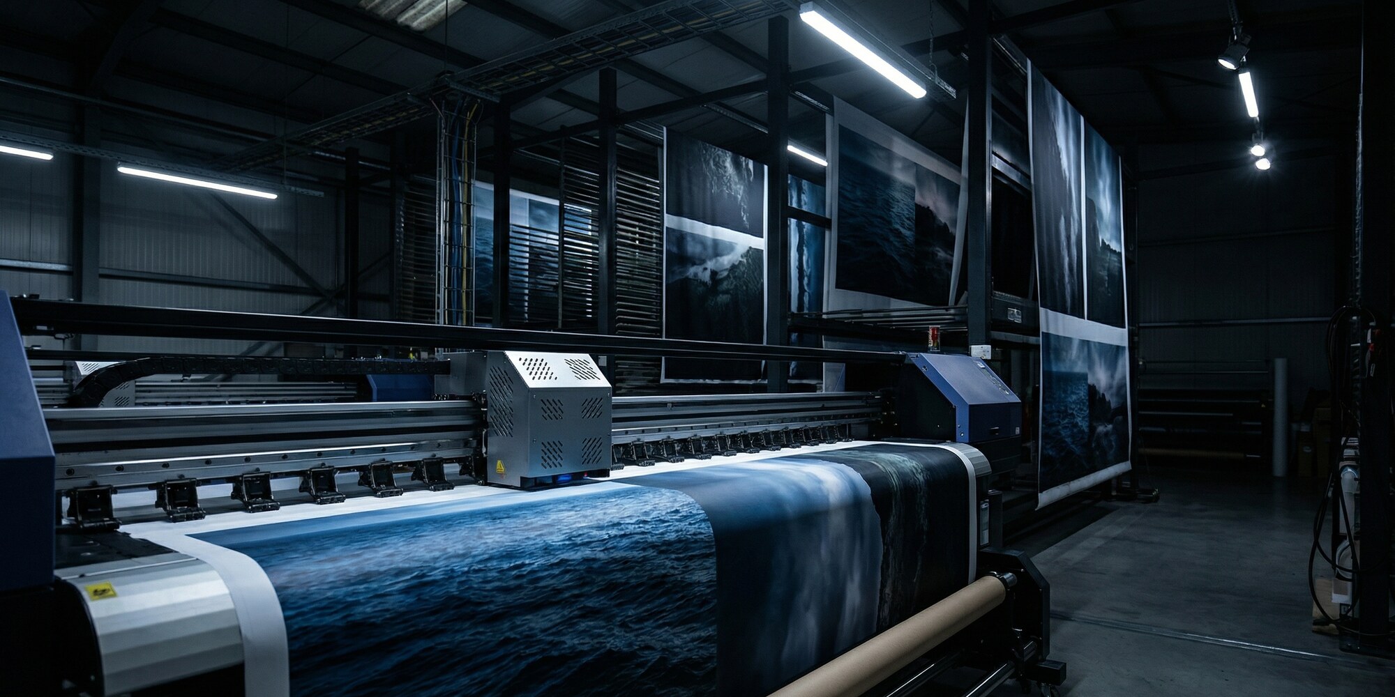
Computer monitors display images at 72 to 96 pixels per inch, and they emit their own light — the image is backlit, vibrant, and essentially at arm's length. Large-format inkjet output for trade show applications is a fundamentally different medium: it relies on ambient light, is viewed at distances of five feet and beyond, and must maintain visual integrity across substrates that range from tension fabric to rigid foam-core panels.
A graphic file at 72 dpi contains a fixed number of pixels. When that file is scaled up to output at ten feet wide, those pixels are spread across a much larger physical area. The result is visible pixelation — blurry edges on text, broken gradients, and logo elements that look like they were rendered on an original Game Boy. The file that looked crisp on a 1080p monitor was never designed for physical scale.
The rule of thumb: resolution requirements are calculated at final output size, not at the size the file was designed. A 10-inch logo file at 300 dpi contains the same pixel information as a 100-inch logo file at 30 dpi — and neither will print cleanly at 100 inches. This is why exhibit industry standards consistently specify resolution requirements in the context of final output dimensions, and why vector artwork — which is mathematically resolution-independent — is the correct solution for logos and type regardless of the output size.
Resolution Requirements by Viewing Distance
The practical resolution standard for trade show graphics varies by application and viewing distance. For large-format panels — backwalls, murals, perimeter graphics — that are viewed at five feet or more, 100 to 150 dpi at the final output size is the industry-standard specification. Large-format print industry guidance supports this range as the functional floor for acceptable output quality at normal exhibit viewing distances.
Close-proximity elements change the equation. Kiosk graphics, countertop panels, product display surfaces, and anything a visitor might approach within arm's reach require 200 to 300 dpi at output size. The human eye resolves significantly more detail at 18 inches than at 10 feet, and exhibit visitors do approach kiosks — especially when they're designed to invite interaction.
The most durable solution for any element containing logos, wordmarks, or typographic content is vector artwork. Adobe Illustrator native files (.AI), properly structured PDFs with embedded vector elements, and EPS files with vector paths scale to any output dimension without resolution loss. If a client's brand guidelines include a print-quality brand kit with vector logo files — as most enterprise-tier brands now do — that's the starting point for any graphic that will appear on a trade show exhibit.
Color Mode and Profile Attachment
The conventional advice — "submit files in CMYK" — is no longer sufficient on its own, and in some production contexts it's not even accurate. Modern large-format printing increasingly operates in expanded gamut configurations that add orange, green, and violet channels to the standard CMYK set. Some production workflows accept RGB source files and perform color conversion in the RIP (raster image processor) to take advantage of the wider gamut. Telling a client to simply convert their file to CMYK before submitting may actually degrade the output if the shop's workflow is optimized for RGB input.
The issue that causes consistent problems is not color mode — it's the absence of an embedded color profile. An untagged file carries no information about the color space it was designed in. On any given monitor, it may look correct. Run through a production workflow, it will shift in unpredictable ways depending on the system's default color handling assumptions. The correct instruction to clients is: embed your color profile. For RGB files, sRGB IEC 61966-2.1 is the standard consumer and professional profile. For CMYK submissions, ISO Coated v2 or GRACoL 2013 are the appropriate specifications for print production.
This is a technical conversation that benefits from a written reference — which is exactly why exhibit houses that maintain detailed client submission guides see fewer file problems than those that explain requirements verbally at kickoff. Operations teams at full-service fabricators like Innovate 3D, which combine wide-format printing with in-house CNC and 3D fabrication, maintain structured file submission requirements that address color profiles, resolution, and bleed before a project enters production — turning what could be a last-minute scramble into a resolved checkpoint early in the timeline.
Bleed, Safe Zone, and Substrate-Specific Requirements
Bleed is the area of graphic content that extends beyond the intended cut edge of a panel. Its purpose is simple: cutting and mounting are never perfectly precise, and a panel trimmed a millimeter short of the intended edge will show a thin white border if the artwork doesn't extend past that edge. Standard bleed for rigid panel graphics is 0.5 to 1 inch beyond the cut edge, depending on the substrate and mounting method.
Tension fabric graphics — which are stretched over a frame and fastened at the perimeter — have significantly larger bleed requirements. Because the fabric is under tension and the edge is folded or sewn into a sleeve, the graphic must extend 1 to 2 inches beyond the visual field to account for the stretch and edge treatment. A graphic delivered to the exact panel dimension without bleed will frequently show the raw edge of the print on a tensioned fabric display, particularly on horizontal runs where stretch is more pronounced.
The safe zone is the inverse of bleed: it's the interior margin within which all critical visual elements — logos, headlines, legal copy, contact information — must reside. A standard safe zone for exhibit graphics is 0.25 to 0.5 inches inside the live area boundary. Anything placed outside this margin risks being obscured by framing, mounting hardware, or the natural edge tolerance of the installation.
"A graphic delivered to the exact panel dimension without bleed will show the raw edge of the print on a tensioned fabric display — and there is no fixing it on show day."
File Formats: What to Accept, What to Flag
Not all file formats are equal in a large-format production context, and the format a client submits is often the first signal of whether the file is going to be production-ready.
Acceptable formats: Native Adobe Illustrator (.AI) files with fonts outlined or embedded and vector elements properly structured. Print-quality PDFs with embedded fonts, embedded color profiles, and vector content preserved — not flattened to raster. Layered or flattened Photoshop files (.PSD) at the correct resolution and output size, with color profiles embedded.
Files to flag before production: JPEG files introduce lossy compression artifacts that compound with each save — a JPEG that has been opened and re-saved multiple times will show visible block artifacts at large output sizes. PNG files exported from web applications are almost universally 72 dpi and RGB-for-screen. PowerPoint and Keynote exports rasterize all content at screen resolution. Google Slides exports are even more constrained. None of these are production-ready for large-format print without significant reconstruction.
The most effective operational practice is a pre-submission checklist — a single-page document that outlines resolution, color mode, bleed, and format requirements, sent to clients alongside the initial contract. Leading exhibit houses publish artwork submission guidelines that clients can reference throughout the design process, reducing the friction at handoff and establishing clear expectations before production timelines are at risk.
The Pre-Production Proof: The Step That Eliminates Most Disputes
Even when a file arrives correctly — properly profiled, at the right resolution, with correct bleed — color perception is subjective and output-dependent. What a client sees on a calibrated design monitor will differ from what comes off a large-format inkjet printer, particularly for brand colors and gradients. The pre-production proof is the safeguard that closes this gap before it becomes a post-delivery dispute.
A properly structured proofing workflow involves outputting a scaled proof — typically 10 percent of final size — on the same substrate material that will be used in full production. The proof is reviewed against the client's brand standards and any physical reference materials provided, color corrections are noted, and the client signs off on the approved proof before production runs begin. The client sign-off is documented in writing, with a clear statement that production will proceed based on the approved proof and that post-production color corrections will be treated as change orders.
This workflow adds a step, and it takes time — but exhibit houses that skip the proofing step to accelerate the timeline consistently pay for it in reprints, client disputes, and the kind of last-minute crisis that damages a relationship regardless of how good the underlying fabrication work is. The proof is not a cost center; it's the documentation that protects both parties when a client says "that's not the color I approved."
The exhibit industry's most avoidable production delays have a common root: a failure to establish clear file requirements before a project begins. Shops that treat graphics intake as seriously as they treat material procurement and CNC programming will find that the hours spent on pre-production file review are recovered many times over in smoother production runs, fewer reprints, and clients who arrive on setup day confident in the work — rather than surprised by it.